 Early in my career a grizzled old veteran of marketing and communications for nonprofits said in a meeting “its all comes down to the T-shirts.”
He meant that when it came to marketing and communications campaigns the biggest battles were often over the smallest things, like the T-shirt. Because when it comes to marketing and communications while almost nobody knows anything of the marcom concepts of ‘return of customer investment’ or, ‘share of requirement’ everybody from the CEO to the janitor understands T-shirts.
I’m now a grizzled old veteran and I beg to differ. Everybody seems to want input on T-shirts, that’s true enough. But it’s not all about the T-shirt.
No, in cause marketing one of the details you should obsess over is the picture… or pictures… that illustrates the cause. Among other talents, these days an effective cause marketer better be a good photo editor.
The classic example is Special Olympics. As soon as you see the kids racing in a pool, getting a medal, or reaching out to hug a volunteer, you know everything you need to know. The picture tells more than all the words that follow ever could.
Likewise, a group of woman wearing pink logo T-shirts with their arms draped around a friend whose head has a bandanna tied around a bald head sums up Susan G. Komen’s story with just one photo. A kid being lifted into the cockpit of a jetfighter from a wheelchair tells almost the whole story for Make-A-Wish.
To a degree you can do the same with hospitalized kids, but it’s trickier. At Children’s Miracle Network… which raises money for 170 children’s hospitals in North America… we would never showcase a kid who subsequently died. It cut against the cultural grain. Nor did we often use pictures of a child in a hospital bed with 20 tubes and hoses going into the child, although that image certainly conveys plenty of information.
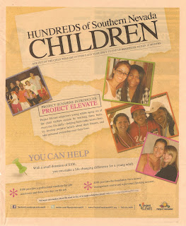
Other charities don’t have it so easy, Project Sunshine in Southern Nevada, for instance. Project Sunshine has a program called Project Elevate (don’t ask me what the fetish is with the word ‘project’).
Project Elevate aims to help the kids that ‘age out’ of child welfare system by teaching them life skills and providing things like work clothing. Otherwise, the ad copy in a weekly magazine called VegasSeven tells us, they run the risk of ending up destitute in less than 2 years.
Who could argue with a mission like that?
I described Project Elevate in less than 50 words. But just how does Project Elevate illustrate its mission with pictures?
The approach they take in the ad is to use multiple photos, which strikes me as a half-measure. They need to show the diversity of kids affected. But because none of those snapshots has any context they’re just faces, not individuals. And Project Elevate's goal has to be to make us care about the individuals, not the problem.
Imagine instead if the Project Elevate got VegasSeven to run a series of ads, maybe over six or 12 months. And instead of showing snapshots of activities they instead told the story of one kid who had aged out, received help from Project Elevate, and was now working/going to school. That is, demonstrating that they weren’t destitute.
Instead of snapshots, the pictures would show them in class, holding a test tube to the light, crossing the quad, eating pizza with friends, waiting tables, answering phone calls, selling something in a retail store, etc. If the picture was done well, the body copy could be pretty sparse.
They’d want to tell more than one story. And whether they got space from VegasSeven or just posted them on the website, or Facebook, the picture would be a vital piece of the story.
Comments